
Horizon: Platov Airport Business Lounge Designed by VOX Architects
Construction of the Platov International Airport in Rostov-on-Don was completed in the late 2017 as part of preparation for hosting the world football championship. Recently, Platov has become the first Russian airport that received the highest service score from reputable British agency, Skytrax. The general architectural design of the airport building was developed by the London-based bureau Twelve Architects, while the international airline business launched were designed by Boris Voskoboynikov ,VOX Architects.
Platov International is the first airport in the history of the New Russia constructed from the scratch. In total, 27 companies applied for the airport architectural concept design tender, and eventually the contract was awarded to the London-based bureau, Twelve Architects. The architects attempted to implement the idea of ’the air bridge’, but the local residents have found the project shapes and lines to be reminiscent of the river Don. VOX Architects studio (project team: Boris Voskoboynikov, Mariya Akhremenkova, Andrey Koskov and Lubov Orlova) designed the international airlines business lounge, Priority Pass, based on the sunset and sunrise concept, while drawing inspiration from the generous nature of the southern region – the beauty of the endless steppe horizon. The visual imagery is based on the emotional, tactile and associative techniques, where each elements of interior performs both by itself and when combined with the lounge space in general, thus creating the dramatic design scenario.
The total area of project is 280 square meters, Essentially, the business lounge serves acts as a separate space – the so called ‘room inside the room’ artificially created by mounting the walls without roof In the main airport building. Thanks to such solution, the project has a lot of air and sunlight shining through the airport glass ceiling. The architects admit that all the ideas were successfully implemented as part of the project, so the lounge on the actual pictures looks even more impressing, then on the visual concepts.
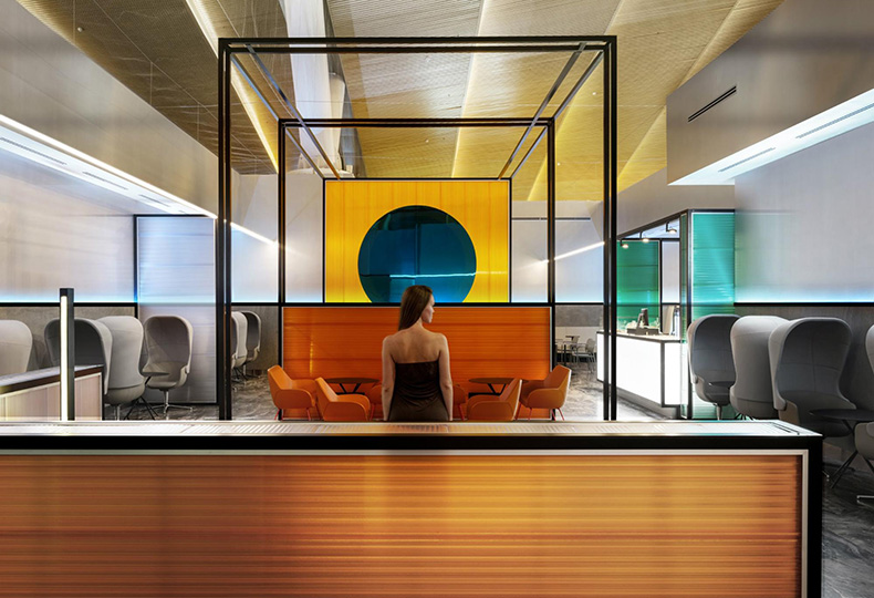
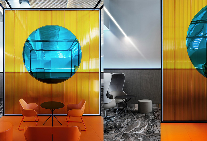
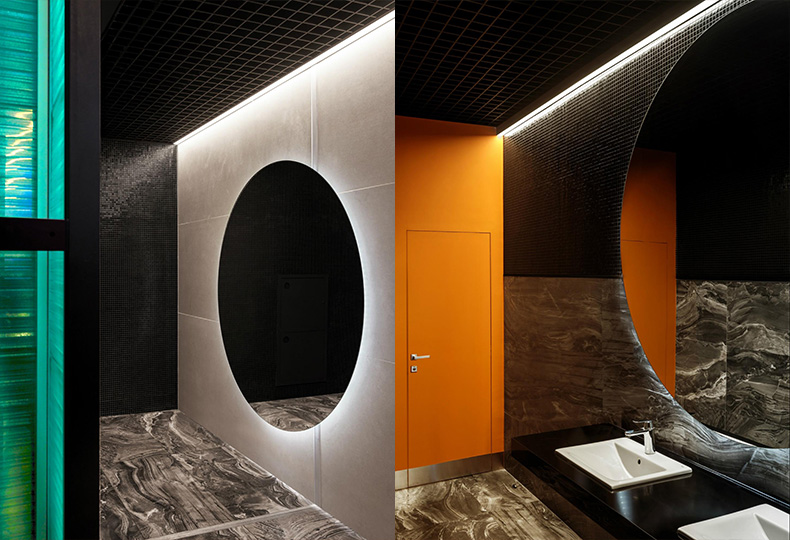
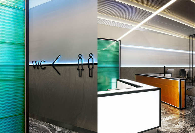
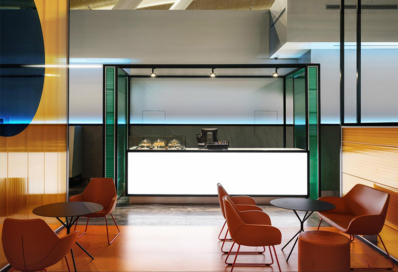
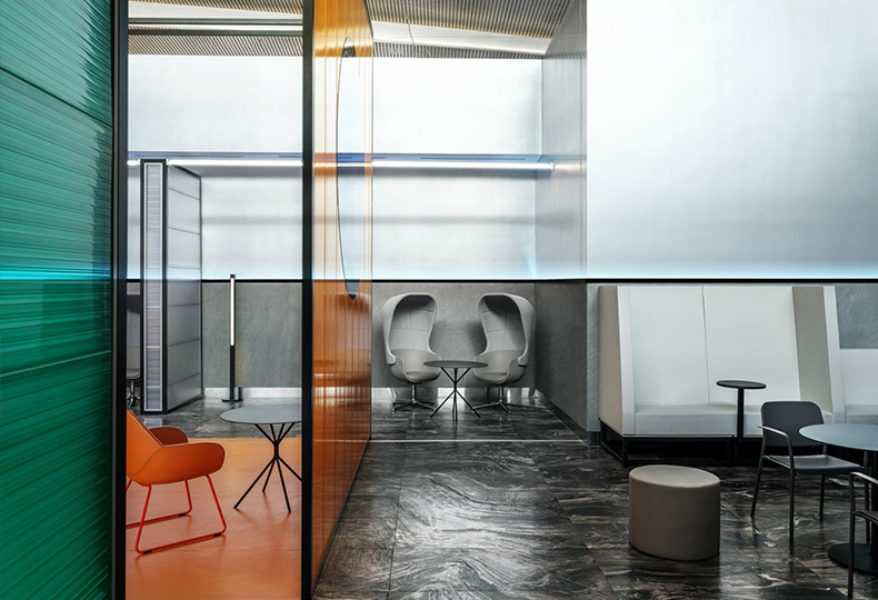
The walls demarcating the lounge limits are of subtle grey color (the architects used Sikkens and Baldini paint). The floor features the spill-like patterns and reminds the actual marble (ceramic granite floor finishing by Flaviker). The emphasized elements here are the corrugated partitions made of semi-transparent polycarbonate, LEXAN, that divide the space by the functional areas. The partitions that feature various height, proportions and color are enclosed into thin metal frames echoing the horizon imagery. In the space with missing ceiling, they create the feeling of lightness, in even zero gravity. In the perspective, the transparent layers and thin lines overlap with each other, which enhances the impression of evanescence. The central element is the large reflective blue sun that increases the illusive space depth.
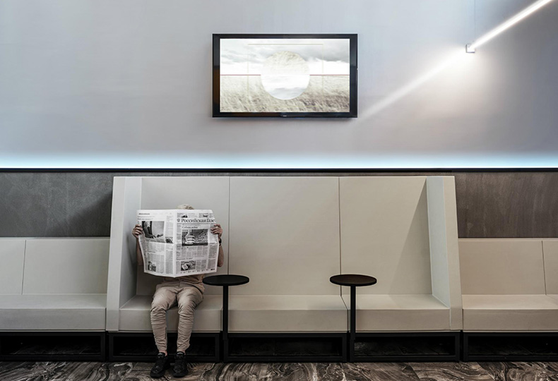
In order to create the atmosphere of comfort for passengers, the architects paid a lot of attention to details, such as well-thought arrangement of USB ports and Wi-Fi chargers. Thus, the lounge also features high SixInch seats with in-built tables and chargers. Although the space is generally open, the lounge also offers several privacy spots. In particular, besides from simple seats and neat stools, the architects also added to the interior high envelope chairs that reduce the foreign noise.
Small cafe located within the Priority Pass territory is distinguished from rest of the space using the orange floor covering that perfectly fits in with the corrugated partition panels of the same color.
The whole idea was to lead the upper part of the space away from corporality, make it look ephemeral and dissolve it. This is the reason why the lounge has no ceiling and features only those transparent partitions dividing it by the functional areas. The partitions are of various height, proportions and color, but are enclosed into similar thin metal frames echoing the horizon imagery. The metal profile located at the eye level of a standing person marks the graphic line on the partitions along the entire space perimeter. This is inspired by the sunrise steppe horizon with the first glimpses of blue shining light. The lower partition profile lines feature the finishing making them look heavier, while the profile itself has the hidden linear light source, illuminating the surface from beneath with blue light.
All photos: Mikhail Loskutov.
 BORIS VOSKOBOYNIKOV, MARIA AHREMENKOVA
