S Y N D I C A T E Bureau: We Find Beauty in Ingenuity
Moscow architectural bureau S Y N D I C A T E was founded only around a year ago, and now they already work on designing Garage Screen venue, where the local residents will be able to go watch a movie during hot summer season. Good start for you, S Y N D I C A T E! As part of Design Mate’s January topic, which is Design as Headstart, we decided to arrange a short interview with the guys about upcoming Garage Screen and other current bureau’s projects, as well as about their creative methods and general approaches towards art.
When was the bureau founded and who are its architects?
Our bureau was officially founded around a year ago, but we had started to work together on projects much earlier. We’ve participated in architectural contests and worked on projects of various scare already for four years. Currently we employ four persons with significant professional experience, since everyone of us previously had worked in major foreign offices, such as Herzog & de Meuron or E2A, as well as had been engaged in major projects here in Moscow. Then at one point we realized that it’s time for us to start our own business, develop our own vision of architecture, and after we came up with this idea, nothing could literally stop us.
What do you mean when you say that every project should be read as a text?
This phrase, “to be read as a text”, shouldn’t be taken literally. By saying this, we simply mean that every project is a kind of story that may be metaphorically read and comprehended by looking into the object. We believe, that in the first instance, every project should be exciting from the intellectual perspective, where a viewer or a visitor may discover more and more interesting features and traits each times he or she looks into design. That is to say that the object should not be viewed in a simplistic manner, as if the building didn’t have anything except for its façade. The object should be designed in such a way as to create an interesting association and interaction with the surrounding context at the different levels from the city planning in general to the design of the smallest details in particular.
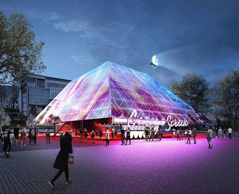
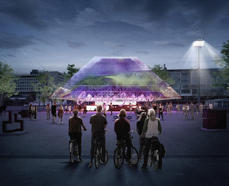
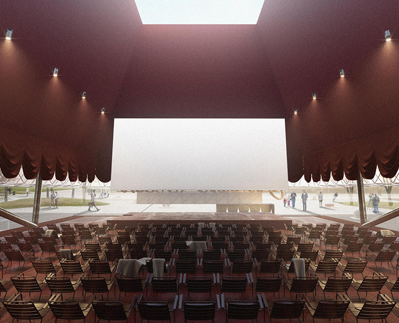
Garage cinema Screen
So what kind of text a visitor should read when looking into Garage Screen project?
First of all, it is a story. We called it “Watch and Be Watched”. The key concept here is to turn the process of watching a movie into artistic performance, where, on the one hand, a viewer is watching what is going on the screen, while, on the other hand, each random visitor who wanders around the square also quietly watches those who watch the movie. This idea of transparency is reflected in the external envelope of the cinema building. Depending on the angle of view, it may appear to be either transparent allowing a glimpse into the pavilion’s interior and turning a whole cinema complex into another showpiece standing just in front of the Garage Museum, or highly refractive so the pavilion almost disappears amidst of the square.
Would you please tell a little about the work you have done on this project?
It is rather complicated to present all we have done as a some kind of linear process. We started with our main concept and then attempted to express it using the language of architecture. At the same time, we were given strict technical specifications and did our best to comply with their requirements as much as possible. We tried out several options, consulted with construction engineers and technical staff. Eventually, we managed to develop volumetric solution matching with initial idea and started experimenting with different materials, which inherently changed the pavilion structure. This iterative process continued until we came up with what you may see now.
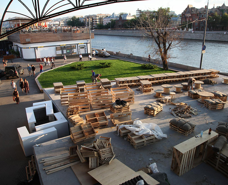
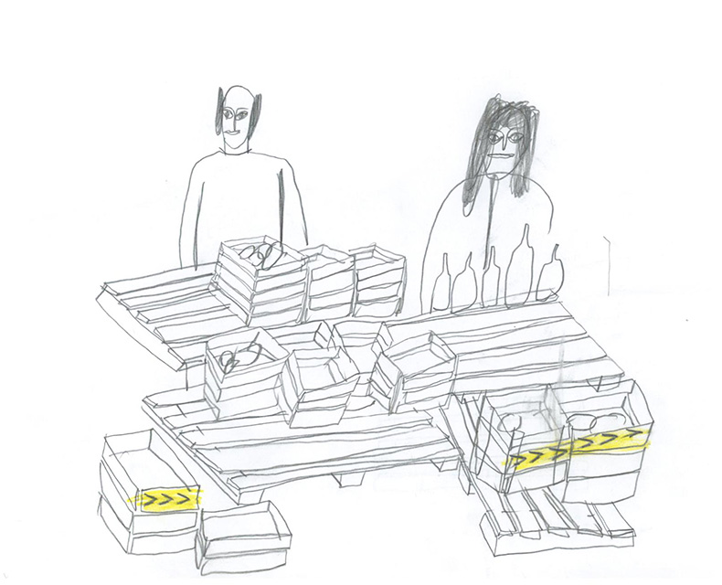
One of your first projects is Lavka Lavka Market, where you constructed stands and showcases from wooden crates. Do you usually utilize different approaches depending on the funds available for project implementation?
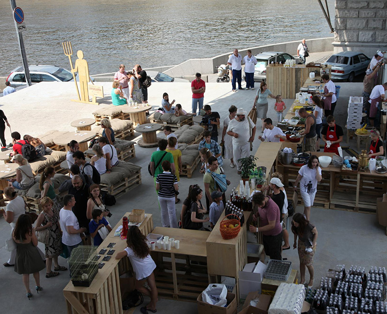
When working on LavkaLavka, we didn't actually experienced much troubles due to the limited budget. The main task there was to comply with the customer’s stylistic requirements and the project timeframes. All the elements were produced from pallets and cable reels. Therefore, we don’t see a problem in dealing with limited budget, if you understand the limits you have to stay within from the very beginning. It is possible to develop unhacked solution with cheap materials, but it is much more complicated to reduce the cost of a ready concept without sacrificing its architectural and aesthetic value.
Lavka Lavka Market
Both projects are intended for temporary mounting. How does this feature affect the architect’s work?
Here you have to catch a general point. On the one hand, such conditions grant an architect a certain degree of freedom, where you are able to come up with some brand-new unique solution. On the other hand, it implies strict limitations related to the engineering and technical aspects of your solution, since all the elements must be light-weighted and easy to mount. Such prerequisites significantly affect the architectural treatment of the project. The advantage of temporary facility architecture is that your solution does not get old, but remains only on photographs with its initial appearance.
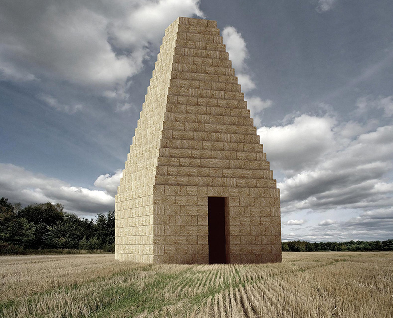
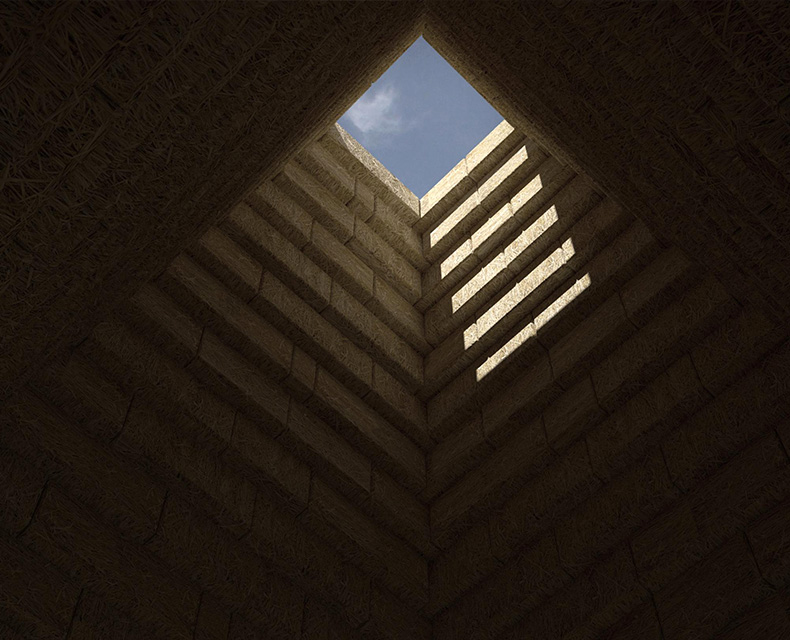
Your project for Nikola-Lenivets sounds more like a public art rather than architecture. So what is the principle difference between these two directions? What traditional approaches an architect should abandon, and what important aspect he or she should keep in mind. While working on the artistic projects?
Actually, we appreciate such balance between architecture and art. It allows us to search for new concepts and senses in our trade. Still, I wouldn’t say that the process of working on Nikola-Lenivets project was significantly different from our efforts on Garage Screen.
Nikola
How would you estimate an importance of beauty for your projects and how do you understand the concept of beauty in general?
I guess this is the most complicated question so far. The beauty is a very controversial concept. Currently, we may observe the fashion trends that exist on the edge between the beauty and the ugliness and affect various design field from architecture to apparel. As for us, I would say that we find a beauty in ingenuity.

